
🌐 Website • 💡 Getting Started • 👀 Demos


SVAR Svelte Core library offers 30+ lightweight, fast-performing Svelte UI components with TypeScript support. Beautifully designed light and dark themes are included and fully customizable via CSS variables. A straightforward API and comprehensive documentation make it easy to start building feature-rich Svelte interfaces quickly.
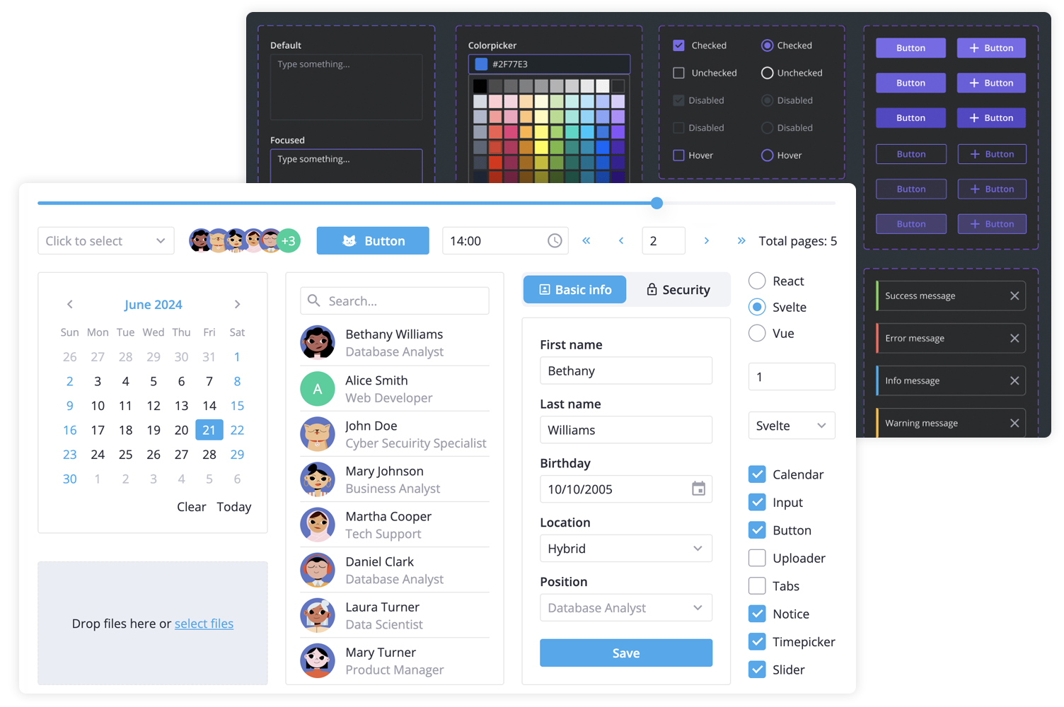
SVAR Svelte Core library includes the following components:
- buttons & form controls,
- calendar (datepicker),
- popups, tooltips,
- notifications,
- sliding sidebar,
- tabs, and more.
Additionally, you can use these SVAR Svelte components to build unified app interfaces:
- Menu - helps you create basic menu bar, actions or context menu;
- Toolbar - allows you to create button and icon panels with configurable layouts;
- Tasklist - task list component to add, edit, check or delete tasks;
- Comments - nice-looking comments section;
- File uploader - simple file uploader component.
To start using components from the Core package, simply import the package and include the desired component in your Svelte file:
<script>
	import { Button } from "@svar-ui/svelte-core";
</script>

<Button>Click me</Button>
See the getting started guide to quickly set up and begin using SVAR Core components in your Svelte projects.
Typically, you don't need to modify the code. However, if you wish to do so, follow these steps:
- Install vite-plus (
curl -fsSL https://vite.plus | bashon Mac/Linux,irm https://vite.plus/ps1 | iexon Windows). The project usespnpmworkspaces under the hood, so plainnpmwill not work. - Run
vp ifrom the project root to install dependencies. - Run
vp run buildto build all packages. - Start the demo app in development mode with
vp run start.
Post an Issue or use our community forum.